I hear and I forget. I see and I remember. I do and I understand.
— Confucius
You can see your data. But can you touch, feel or hear it?
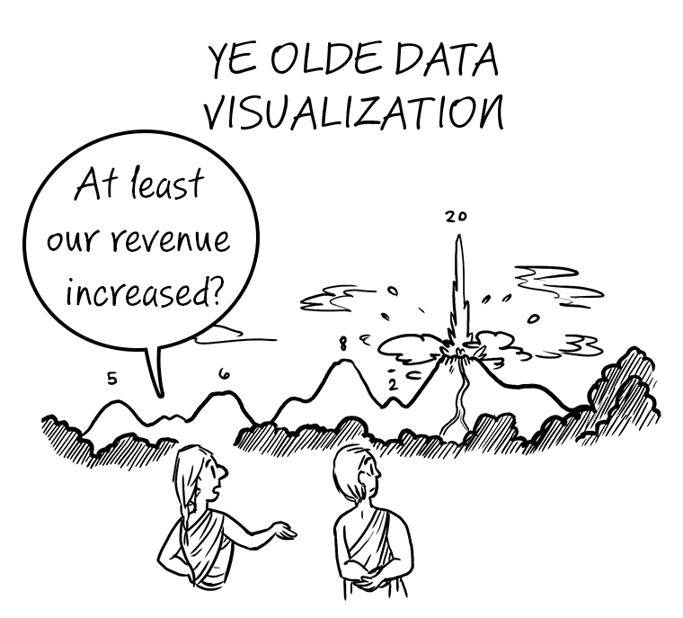
Data is at its most powerful when it is tangible. Charts and graphs give us insights and allow us to see connections we might have missed. Thoughtspot takes those insights to new heights for non-technical business people— but what if there were a way to bring those digital visualizations into the physical world? What if you could actually touch and feel your charts and graphs?
As the Operations team here at ThoughtSpot, we are where the rubber hits the road. We deal in the tangible: we keep the lights on, we develop and own manufacturing pipelines, and we run the day-to-day processes that allow the company to function and excel. Our “hands-on” perspective inspired our theme for our internal CodeX hackathon project: bringing data and charts off the screen and into the physical world.
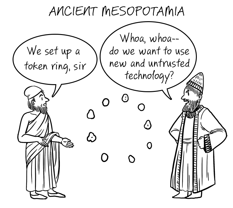
Physical representations of data are nothing new. From Mesopotamian clay tokens in 5500 BC to teaching children about fractions with slices of pizza, this powerful method of data visualization has endured the test of time. The power of data visualization in the real world is rooted in shared experience: it’s as real for you as it is for your viewers.

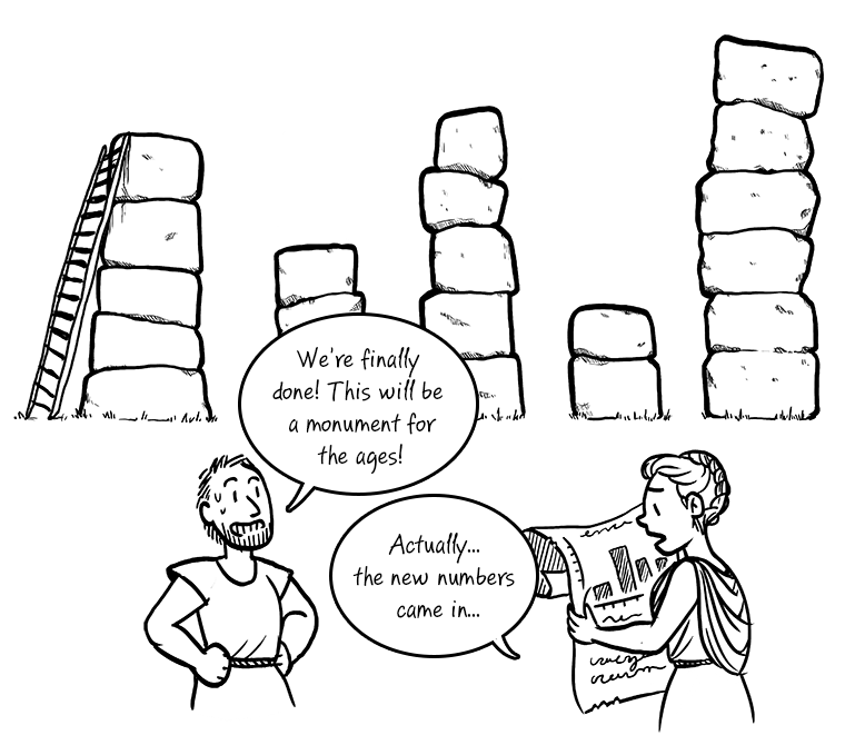
We live in a physical world, and pragmatic visualizations help us understand and model data in a way that charts and graphs just can’t. General Motors uses LEGO(r) bricks as a practical and effective data modeling tool: General Motors’ 3D LEGO Visualizations. The simplicity of this Rearrangeable 3D Bar Chart is ingenious. Visualizations in the physical world can take traditional charts and graphs to a new level. In 2015, the London Eye was transformed into a 135m Tall Donut Chart during the week before general elections. An ordinary graph or infographic can display the same chart, but the impact doesn’t even come close. Large-scale data representations are powerful, understandable, and impressive.

Unfortunately, representing data in a tangible way is usually as labor-intensive and cumbersome as it is powerful— it’s not the kind of thing you can throw together for a presentation that afternoon. The representation is almost always static, which limits it to the simplest of use cases. And the mechanics of the visualization— the act of creating or manipulating those tangible, physical objects— are invariably DIY.

What if we united the power of search-driven analytics with the high impact of physical, tangible data visualization? Could we manipulate tangible data in a physical, durable, and automatable way? Would our insurance cover it?
We had an idea, a question, and a challenge: install something tangible in three days. After all, someone’s gotta keep the lights on— and as the Operations Team, we’re it. Even with team members juggling active 24/7 on-call rotations, we were able to build something pretty slick.
Here’s what we built:
We prototyped a platform to allow Thoughtspot to communicate with microcontrollers and that opened up a world of exciting possibilities. We queried Thoughtspot programmatically, interpreted the data for display, and then passed it to microcontrollers for consumption. Motors turned, lights blinked, and our dynamic representation of data— by manipulating physical objects— illustrated the results in a way that won’t soon be forgotten.
With the proliferation of low-cost embedded platforms, software libraries, and even consumer-accessible 3D printing, representing data in the physical world has become a practical option. Large-scale and physical visualizations democratize your analytics in the same way that Thoughtspot democratizes your data: everyone can experience it in a tangible way.
Keep your eyes peeled for our wooden box and pulley accessories coming soon to a ThoughtSpot release near you.
If you haven't already, check out Part 1 of our CodeX blog series.


