Analyzing data is no longer just for the data team. When more people are able to analyze data within an organization, the business generally performs better. In fact, 87% of respondents to a recent Harvard Business Review survey indicated that their organizations would be more efficient if their front-line workers were more empowered with data.
However, finding insights is just the first step in driving change. The real value comes when people can use insights to weave a narrative that drives action and makes a tangible impact.
In this article, we’ll explore what a data story is and how you can create a clear and concise narrative around your data.
Table of contents:
A data story is a narrative constructed around a set of data that puts it into context and frames the broader implications. Unlike business intelligence or data science that emphasizes the technical task of turning data into insights, a data story brings these insights together with qualitative analysis and domain expertise to better understand a relevant business goal or objective.
Data storytelling is the skill to craft the narrative by leveraging data, which is then contextualized, and finally presented to an audience. It utilizes not only data analysis and statistics, but also data visualization, qualitative and contextual analysis, and presentation.
Telling a story with data is important because it allows the narrator to put the data into context of a broader objective and use tools such as visual aids to help break down the results so that the audience, regardless of their background, domain expertise, or technical sophistication, can easily understand them and their implications.
Data storytelling also helps to explain data to people of different learning styles and allows the narrator to craft the communication methods to the respective audience. For instance, an auditory learner may respond better to a spoken presentation while a visual learner may require more data visualizations and other visual aids. In general, a good data story will include a combination of these various components so a diverse audience can stay engaged.
Data stories are often compared with data visualizations. However, data visualizations are actually just one piece of data stories and are used as an aid to tell a broader story.
Data visualizations certainly help deliver various points in a narrative, but data storytelling also relies on industry or topic expertise and communication skills to help craft the data analysis and visualizations into something that can explain the who, what, why, and how of a broader story.
For instance, you could create a series of data visualizations around the change in sales over time for a specific product line. The visualizations may make it clear that there is a change occurring in the trend of the sales, but a data story would allow you to put this into context of broader themes such as marketing campaigns or supply chain constraints limiting inventory.
While data storytelling is a broad process that can vary in its technical nature and domain, there are several key components that can be applied to any successful data story:
1. Find the story within the data
Before constructing a data story, you must first determine what the data is actually telling you. For instance, a correlation or causal link in a dataset may provide an interesting insight that can inform a more meaningful narrative. This provides a starting point into building a data story that can be conveyed to a larger and potentially technically diverse audience.
2. Consider your audience
The next step is to determine who the story will be conveyed to and what their backgrounds are. This is important in determining the technical complexity of the analysis and what components of the story the listeners will want to learn about. For example, an executive team will likely be more interested in understanding the broader business implications, while a data science team will be more focused on the statistical aspects.
3. Determine what data matters
It’s common to get overwhelmed with data when constructing a data story. Modern businesses collect so much information that determining which datasets are most relevant to the broader narrative can be challenging. In general, it’s important to start by identifying the data that can inform the topics you’ll want to explore instead of looking at all the possible data available. For example, if you’re planning on telling a story about customer experience then product usage data, sales data, and customer feedback may all be relevant, but employee experience data may not be. Doing so will ensure that the key points do not get diluted and that listeners or readers do not get distracted.
4. Analyze data and find insights
With the most relevant data identified, the next step is to perform data analysis to find insights that create meaning out of the data. Perhaps there’s a correlation between some key datasets that was not otherwise understood, or there was a spike or dip in activity around a certain time. Digging into these relationships and patterns can help to provide the general themes of the data story.
With ThoughtSpot's Spotter, as your AI Analyst, you can simply ask a question in natural language and gain instant insights and visualization to ensure that your story is always relevant.
5. Identify the most effective data visualizations
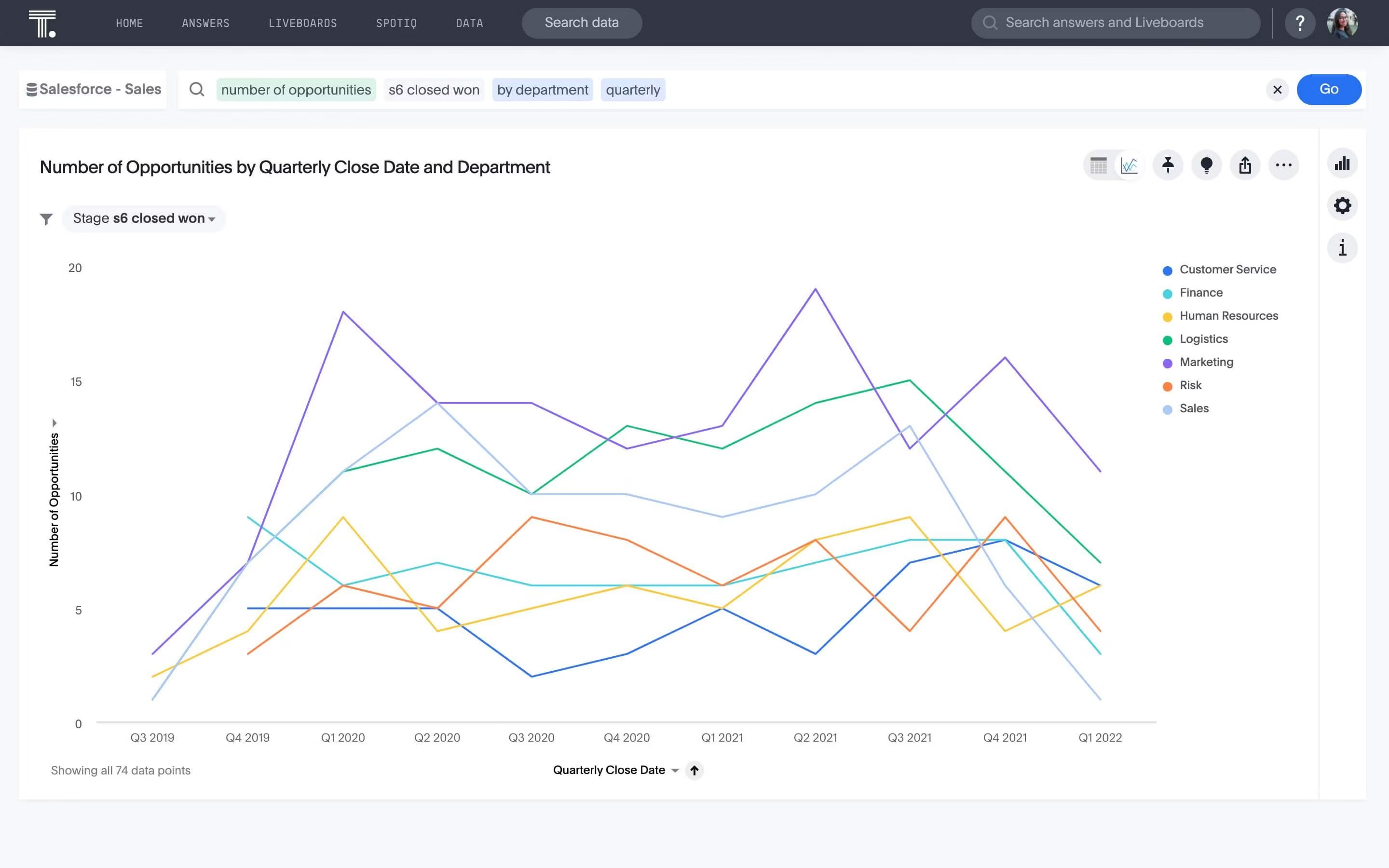
Data visualizations are a powerful way to help an audience understand data concepts. However, there are so many different types of visualizations so it’s important to pick one that best represents your data. For instance, if you’re showing a trend over time, it’s likely you’ll want some type of chart that includes time series information.

If you’re not sure about what visualization best represents your data, you can search in ThoughtSpot, which will use AI to provide recommendations on the best visualizations to represent your question. With Liveboards, you can go beyond static charts and use interactive visualizations that you can explore in real time.
6. Provide context
Data on its own is not enough to create an optimal data story. The domain expertise around the topic is essential to crafting the right narrative, and making it understandable to the audience. Therefore, it’s critical to weave context and data insights together. This doesn’t just mean providing an overview at the beginning before diving into data visualizations. It means framing the data insights with the business reality and any other relevant information that your audience may not otherwise be familiar with throughout the entire story.
Perhaps a correlation is caused by something that is very specific to an industry or business segment, or maybe there’s an anomaly in the data that is impacted by an external event. Pointing these out will be important to provide sufficient context to understand the broader narrative.
7. Structure your story
Telling a traditional story often includes providing an introduction, a rising action that builds tension through problems, a climax that provides a crucial moment or insight, a falling action that resolves the problems, and a final resolution and retrospection.
This type of flow is often still valuable in telling a data story. Leveraging a structure that people are familiar with will help capture their attention, create a framework for information consumption they’re already familiar with, and allow them to better understand the relevance and importance of the story that the data is telling.
8. Edit until the story is clear and concise
When presenting a data story, regardless of the topic, it’s important that the story is clean and to the point. As with other writing and presentation, you should continuously review and edit the narrative until it’s extremely clear. As Blaise Pascal famously said “If I had more time, I would have written a shorter letter.” The same is true for data stories. Avoiding fluff that distracts from the main points is critical to ensure the audience is focused on what really matters.
Visualizations are an essential part of a data story. A big part of building out an effective data story is selecting and building visualizations that provide the most impact. Here we’ll dive into a couple examples of effective visualizations that guide a broader narrative.
Homelessness in America
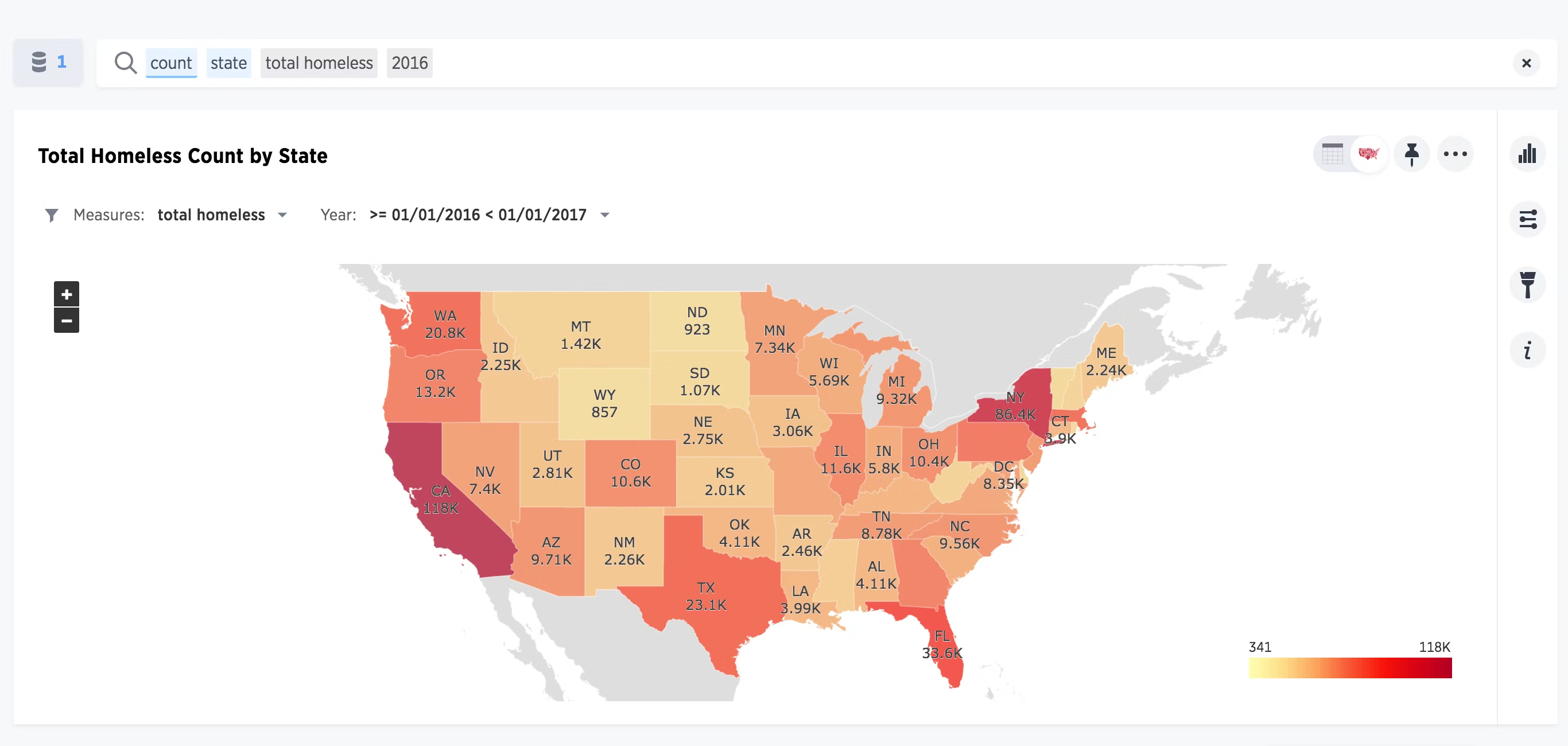
In this blog about trends of homelessness in America, the author provides several examples of impactful charts. For example, in the following graph, the author is able to segment homeless data by state and includes a color-based density indicator so that viewers can quickly see where homelessness is particularly acute across the US. While the raw data is likely large and complex, this visualization allows us to quickly understand the implications with very little technical competency required.

Are hurricanes getting worse?
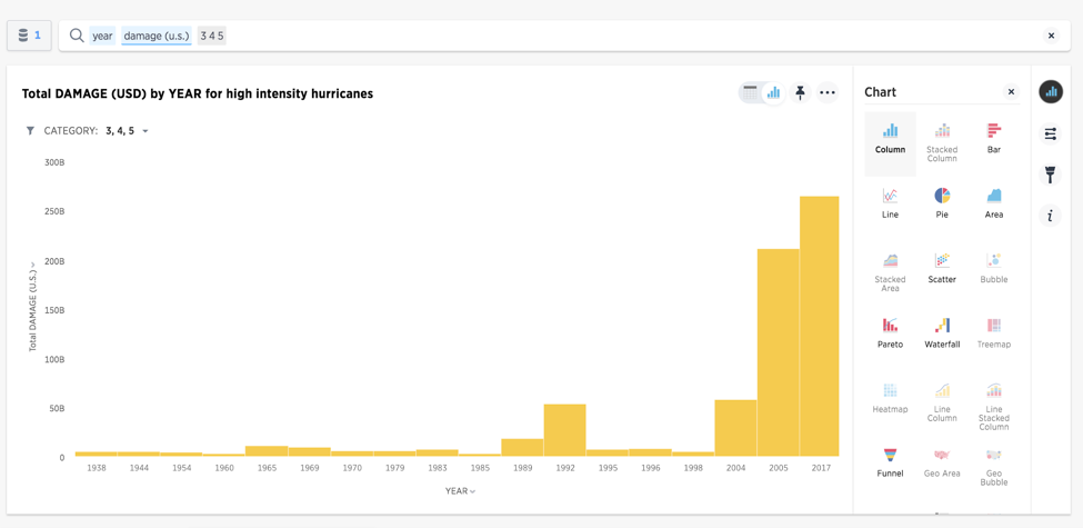
In this next blog on whether hurricane severity is increasing, the author provides more time-based visualizations. This makes sense, as the narrative is around the acceleration of various severity measures of storms. For instance, the following chart clearly shows that total monetary damage has grown extremely fast in aggregate in recent decades.

Now that we have a good understanding of how to build a clear data story, let’s dive into a few final tips and tricks that can help ensure the narrative is as effective as possible:
1. Visuals are necessary
As we saw in the previous section, visuals are a great way to represent otherwise high volume or dense data into a way that’s quickly comprehendible to the viewer. These visualizations are likely what most viewers are going to anchor on when you’re presenting, so it’s important to pick ones that best represent the insights and present clear evidence of the point you’re trying to make.
2. Relevance is key
Data stories are often packed with information and therefore you should only include points that are relevant to your core narrative. Tangential or otherwise irrelevant data will just distract your audience so should not be included in the presentation.
3. Data must be timely
Trends and correlations can change quickly. Therefore, you should use the most up-to-date data possible to ensure that the analysis is fresh and not telling an outdated story. Using augmented analytics, ThoughtSpot also auto analyzes your data and alerts users to identified patterns and trends.
4. Use data ethically
While using relevant data is important, you should also not cherry-pick data to tell in inaccurate narrative, nor should you present misleading relationships such as spurious correlations. While it may be tempting to use data to prove a point that benefits you, this is not only unethical but also doesn’t help tell a true story.
5. Create a clear narrative
In the end, data storytelling is a form of presentation — often through public speaking — and therefore you should strive to tell a clear narrative that the audience can easily follow. Speak clearly and slowly and avoid tangents or irrelevant points.
Data storytelling is a powerful tool for conveying otherwise complex data to an audience. It involves constructing a clear and relevant narrative, analyzing and visualizing data, and presenting all the information in a coherent manner.
However, doing so requires having up-to-date data, fast and comprehensive analytics, and flexible yet easy-to-understand visualizations. With ThoughtSpot you can search, analyze, and visualize all of your data in one place. Try a free trial of ThoughtSpot to see how you can leverage the AI-Powered Analytics to build an effective and clear data story.


