


You've built dashboards before. Maybe dozens of them. But here's the thing: your users still can't find what they need, executives are asking for "just one more chart," and your team keeps getting pulled into endless dashboard revision cycles. Sound familiar?
The problem isn't that you're building bad dashboards. It's that most dashboard design approaches treat symptoms, not causes. When your dashboard becomes a static report that raises more questions than it answers, you end up right back where you started, fielding requests and building more dashboards.
Modern dashboard design goes beyond arranging charts on a screen. It's about creating interfaces that actually help people make decisions faster, with less confusion and more confidence. Let's dig into what that looks like in practice.
Dashboard design is the strategic arrangement of data visualizations, KPIs, and interactive elements to create intuitive interfaces that drive data-driven decisions. But here's what makes it work: combining visual hierarchy, user-centered layout principles, and purposeful chart selection to deliver actionable insights that people actually use.
Modern dashboard design requires understanding your audience, selecting appropriate chart types, and creating layouts that guide users to critical insights quickly. ThoughtSpot’s Liveboards take this a step further by turning static dashboards into interactive, real-time data experiences that invite users to explore, question, and act on insights instantly.
The foundation of effective dashboard design starts with understanding who will use the dashboard and how they'll interact with it. Your user persona should include their technical background, decision-making responsibilities, and specific use cases.
Here's the reality: sales executives use data differently from data analysts. One executive might need high-level performance overviews to identify growth opportunities, while another requires detailed regional breakdowns to optimize tactics.
Key considerations for audience analysis:
Technical skill level and data literacy
Primary business objectives and KPIs
Time constraints and decision-making speed
Mobile vs desktop usage patterns
When you design with your specific audience in mind, you create dashboards that feel intuitive rather than intimidating. Your users should be able to find what they need without hunting through menus or decoding complex visualizations.
💡Find tips to facilitate deeper collaboration with our ‘Context is Gold’ whitepaper.
Different dashboard types serve unique purposes and audiences. Selecting the appropriate type aligns your design with user expectations and business goals.
|
Dashboard type |
Primary users |
Update frequency |
Key features |
|
Operational |
Managers, Team Leads |
Real-time to Daily |
Current performance metrics, alerts |
|
Tactical |
Department Heads |
Weekly to Monthly |
Project progress, team performance |
|
Analytical |
Data Analysts |
On-demand |
Deep-dive capabilities, multiple dimensions |
|
Executive |
C-Suite Leaders |
Monthly to Quarterly |
High-level KPIs, strategic metrics |
Operational dashboard design
Operational dashboards help leaders monitor day-to-day business activities. These dashboards typically update in real-time or daily, providing immediate visibility into operational performance. Think of these as your "pulse check" dashboards; they should surface problems quickly and clearly.
Tactical dashboard design
Tactical dashboards focus on specific projects, departments, or processes. They offer granular insights into team performance and departmental efficiency with weekly or monthly updates. These dashboards help middle management make informed decisions about resource allocation and process improvements.
Analytical dashboard design
Analytical dashboards facilitate detailed data exploration. They're built for users who need to investigate trends, patterns, and correlations across multiple data dimensions. These dashboards should support drill-down capabilities and flexible filtering options.
Executive dashboard design
Executive dashboards provide leaders with strategic overviews of organizational performance. They focus on high-level metrics that reflect business objectives and long-term goals. Keep these clean, focused, and aligned with strategic priorities.
Information overload kills dashboard effectiveness. Choose KPIs that directly support decision-making and business objectives.
For example, in a customer experience dashboard, relevant metrics include:
Product usage rates
Customer satisfaction scores
Support ticket resolution times
Feature adoption rates
Avoid including metrics that don't serve your dashboard's primary purpose. Employee satisfaction scores wouldn't belong on a customer experience dashboard, even if both are important business metrics. Every metric should answer a specific question your users need to resolve.
The right visualization type makes data insights immediately clear.
Comparison charts
Use bar charts, line charts, and bullet charts to compare values across categories or time periods. These work best for showing performance differences and trends.
Composition charts
Pie charts, tree maps, and stacked bar charts display how parts contribute to a whole. They're ideal for showing market share, budget allocation, or resource distribution.
Distribution charts
Histograms, scatter plots, and box plots reveal data spread and patterns. Use these to identify outliers, trends, and statistical distributions.
Time series charts
Gantt charts, area charts, and time-series plots show data changes over time. They're perfect for tracking progress, seasonal patterns, and historical trends.
Relationship charts
Heat maps, bubble charts, and network diagrams explore connections between variables. They help identify correlations and data relationships.
The key is matching your chart type to the story your data needs to tell. Don't force a pie chart when a bar chart would be clearer, and don't use a complex visualization when a simple number would suffice.
Effective dashboard design applies modern UI/UX principles that guide users to the most important information first.
Use white space effectively
Strategic white space prevents visual clutter while highlighting critical data points. Too much white space makes information hard to scan; too little creates overwhelming layouts. Think of white space as your dashboard's breathing room.
Create a clear visual hierarchy
Arrange elements to show their importance order. Use size, color, and positioning to guide attention to key metrics first, then supporting details. Your most critical KPIs should be the first thing users see.
Choose consistent color palettes
Colors influence perception and decision-making. Red-yellow-green coding helps users identify problems and successes quickly. Maintain color consistency across all dashboard elements to avoid confusion.
💡AI for UX design: 5 best practices for product designers
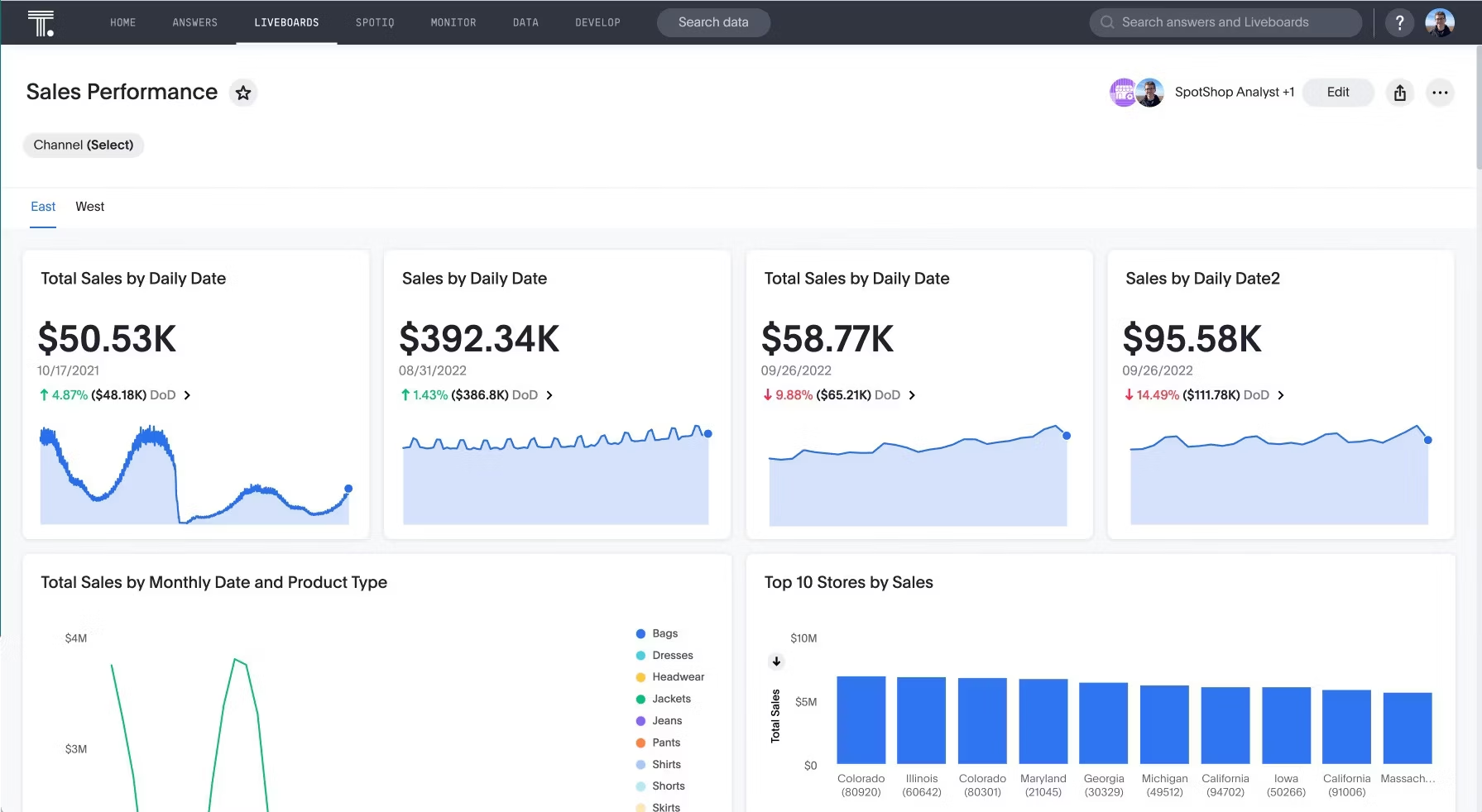
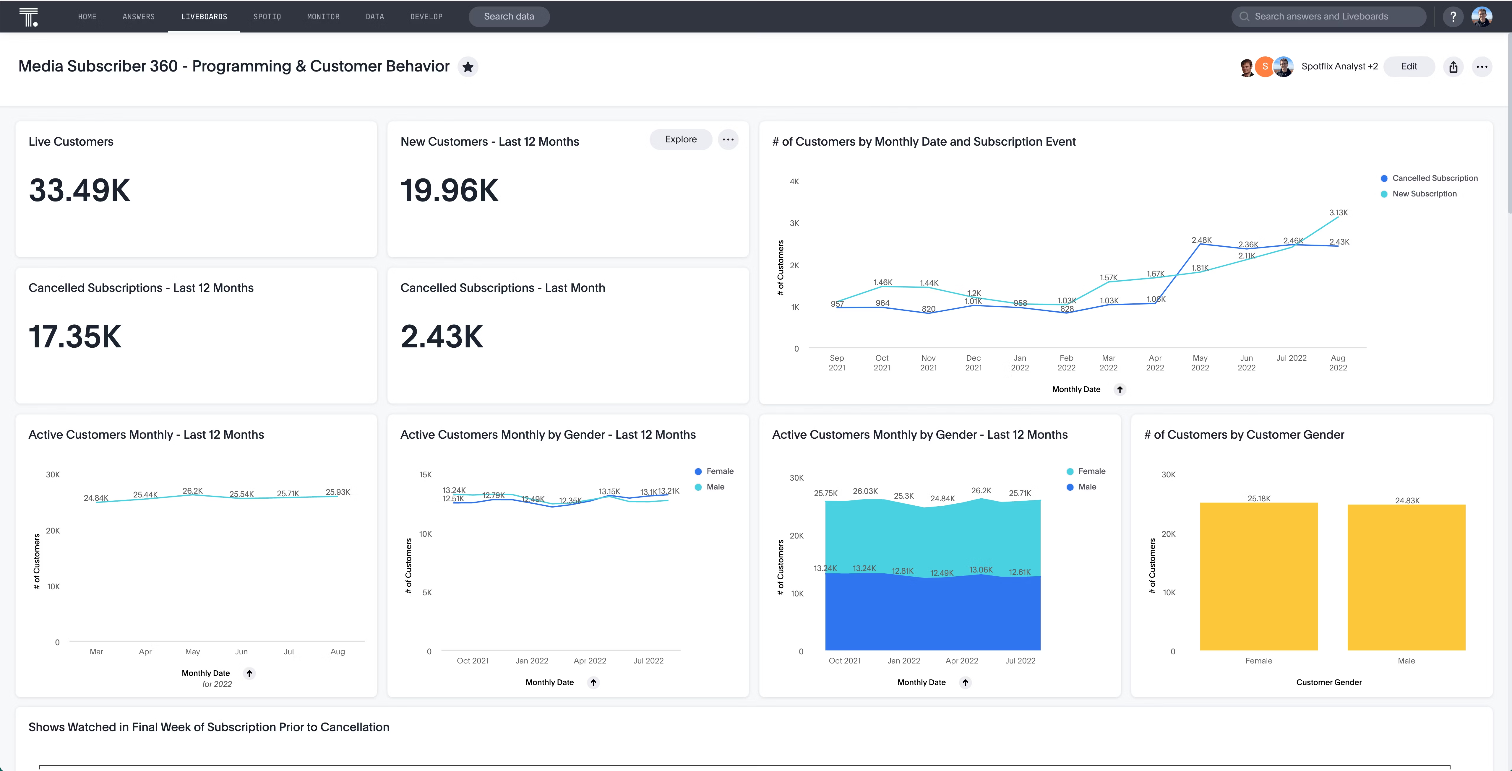
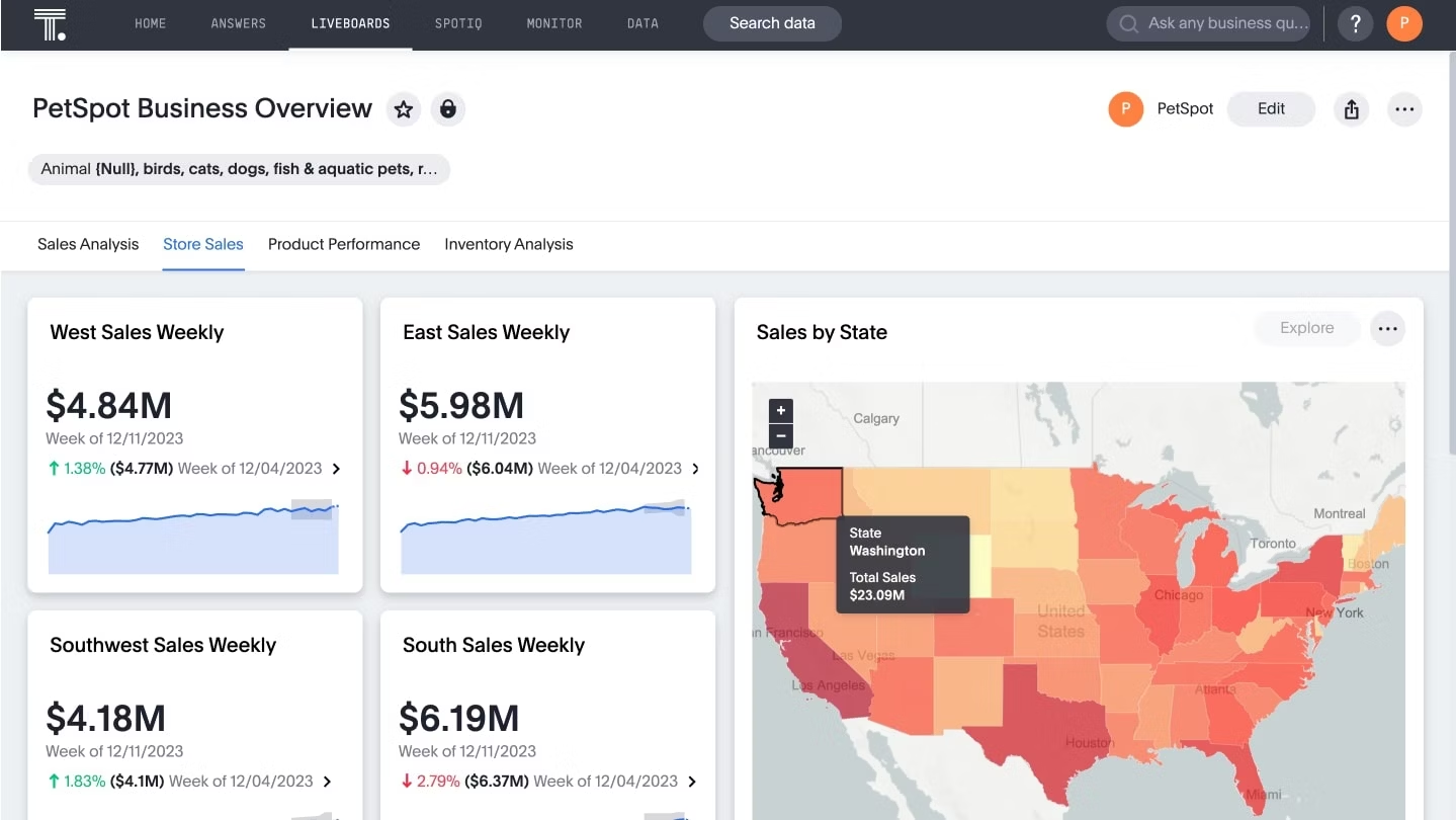
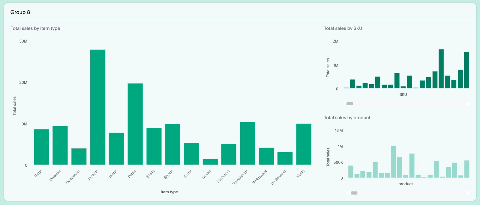
ThoughtSpot Liveboards offer Groups and Tabs to organize information cleanly and intuitively. Used well, these tools help your dashboard tell a clear, structured story without overwhelming users.
Best practices for groups
Create clean, readable sections. Each group should feel like a self-contained insight.
Follow the Rule of 6. Use a maximum of six visualizations per group to maintain focus.
Use common patterns for clarity:
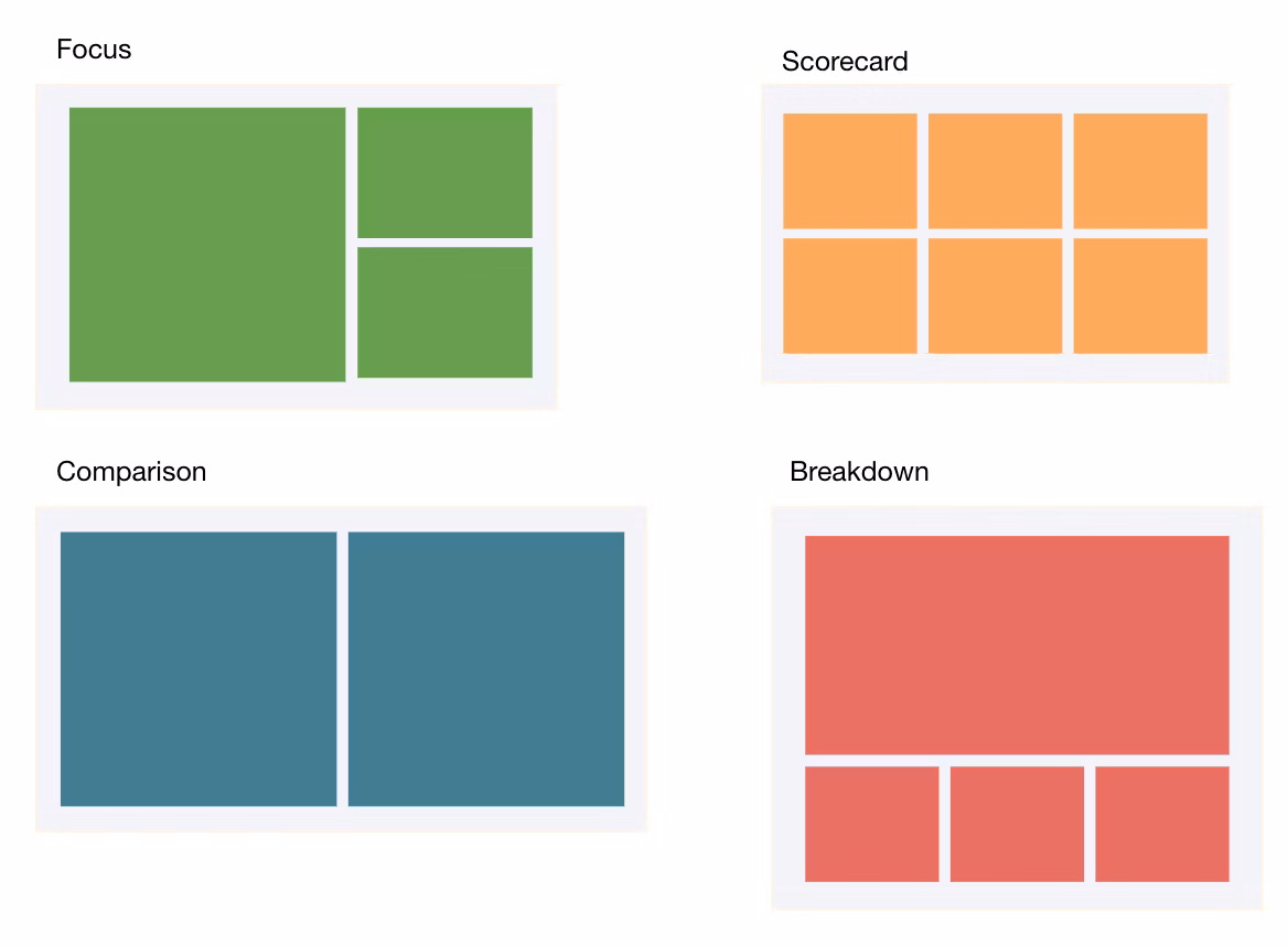
Focus: One primary visualization with smaller, supporting charts
Scorecard: A grid of equally important KPIs
Comparison: Two visualizations side by side
Breakdown: One main aggregate chart supported by smaller charts
Best practices for tabs
Tabs help you tell a focused part of the story and maintain logical separation.
Scope: A tab typically holds four to five groups (up to ~25 visualizations).
Logical separation: Each tab should answer one high-level business question.
Clear naming: Use short, self-explanatory titles like “Sales Performance” or “Inventory Analysis.”
Layout strategy: Guide the user’s eyes
Top-down hierarchy: Place the most important, summary-level insights at the top.
Readable scorecards: For dashboards with many KPIs, split them into smaller, logical groups.
Highlight what’s critical: Keep the most important KPIs above the fold.
💡Pro tip: Use Liveboards’ highlighting feature to draw attention to critical visualizations.
Sizing with purpose
Predictability: Keep visualizations in a row at consistent heights for a clean grid layout.
Draw attention: Use size variation sparingly to emphasize key visuals.
Prioritize readability: If a chart is too small to read, either resize it or combine it with another visualization.
Modern dashboard design includes features that support team collaboration and knowledge sharing.
Effective collaboration features include:
Commenting and annotation capabilities
Easy sharing across teams and departments
Export options for presentations
Real-time collaborative viewing
Context-rich notes and insights
ThoughtSpot's Notes feature allows analysts to add important context and takeaways directly within Liveboards. Teams can share dashboards as interactive presentations, creating alignment around shared goals and insights. This collaborative approach turns dashboards from static reports into dynamic conversation starters.
Understanding standard dashboard components helps create familiar, intuitive interfaces that users can navigate easily. The most effective dashboards combine these elements strategically:
Core metrics display
KPI cards showing single, important numbers
Trend indicators with directional arrows and percentage changes
Status indicators using color coding for quick assessment
Progress bars showing completion toward goals
Interactive elements
Filters and dropdowns for data segmentation
Date range selectors for time-based analysis
Drill-down capabilities for deeper investigation
Search functionality for specific data queries
Visual components
Charts and graphs displaying data relationships
Tables for detailed data listings
Maps for geographic data representation
Alerts and notifications for threshold breaches
Navigation features
Breadcrumbs showing current location
Tabs organizing related dashboard views
Menu systems for dashboard navigation
Export buttons for data sharing
The magic happens when these components work together seamlessly. Your users shouldn't have to think about how to navigate your dashboard—it should feel intuitive from the first interaction.
Strategic layout design determines whether users can quickly find and understand critical information.
1. Grid-based organization
Use consistent grid systems to align dashboard elements. This creates visual order and makes information easier to scan and process. Think of your grid as the invisible foundation that holds everything together.
Information architecture
Top row: Most important KPIs and alerts
Middle section: Primary charts and visualizations
Bottom area: Detailed tables and secondary metrics
Sidebar: Filters, navigation, and controls
This layout follows natural reading patterns and puts the most critical information where users expect to find it.
2. Responsive design principles
Design dashboards that work across devices and screen sizes. Your dashboard should be just as useful on a phone as it is on a desktop monitor.
3. Loading and performance considerations
Prioritize above-the-fold content loading
Use progressive data loading for large datasets
Implement caching for frequently accessed data
Design loading states that maintain user engagement
Nothing kills dashboard adoption like slow load times. Users expect instant access to their data, and performance issues can undermine even the best design.
Real-world examples demonstrate how dashboard design principles work across different industries and use cases.
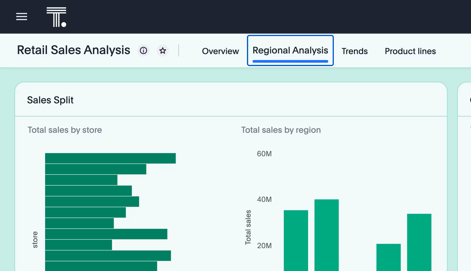
Retail dashboards need to track inventory, sales performance, and customer behavior simultaneously. They provide a unified view of store operations, helping retailers optimize promotions, forecast demand, and improve customer experience.
Key retail dashboard elements include:
Real-time sales performance metrics
Inventory levels and turnover rates
Customer acquisition and retention data
Regional performance comparisons
Seasonal trend analysis
ThoughtSpot Liveboards consolidate multiple retail data sources into a single, interactive view. Built-in features like drill-down analysis and AI-assisted insights help retailers identify performance gaps and customer behavior patterns quickly. When a retail manager notices declining sales in a specific region, they can immediately drill down to understand whether it's a product issue, a seasonal trend, or a competitive challenge.
Financial dashboards require precision, compliance tracking, and risk assessment capabilities. They help leaders monitor profitability, track risk exposure, and stay aligned with regulatory standards.
Essential finance dashboard components:
Portfolio performance and asset allocation
Risk metrics and compliance indicators
Client growth and retention rates
Revenue and profitability analysis
Market trend and competitive intelligence
Financial leaders use Liveboards to monitor real-time metrics like client growth and total asset value. Interactive visualizations help assess overall financial position and identify investment opportunities.
With Spotter, ThoughtSpot's AI Analyst, financial teams can ask natural language questions like "Which client segments are driving the most revenue growth?" and get instant, contextual answers.
Manufacturing dashboards focus on operational efficiency, quality control, and cost management. They provide production teams with real-time visibility into performance bottlenecks, helping them minimize downtime and improve throughput.
Critical manufacturing dashboard features:
Production line performance and downtime tracking
Quality metrics and defect rates
Supply chain and inventory management
Cost analysis by department and product line
Maintenance scheduling and equipment status
ThoughtSpot's search-driven analytics allow manufacturers to query dashboard data naturally.
Users can ask questions like "What's our monthly spending by department?" and receive immediate visual answers. This approach goes far beyond traditional static dashboards that require users to navigate complex menu systems or wait for IT support to modify reports.
ThoughtSpot's approach to dashboard design addresses the limitations of legacy business intelligence tools. While traditional platforms require extensive IT support and rigid report structures, ThoughtSpot's Liveboards offer self-service analytics with enterprise-grade governance.
And it doesn’t stop at Liveboards. With Analyst Studio, data teams can shape and test datasets using SQL, Python, or R, ensuring every dashboard is built on reliable, analytics-ready data.
Meanwhile, Muze brings AI into the design process, helping teams quickly prototype dashboard layouts, experiment with new visualization ideas, and refine how insights are presented before publishing them live. Together, they make modern dashboard design not just easier, but smarter, from data prep to final visualization.
Key ThoughtSpot advantages for dashboard design:
1. Search-driven analytics
Anyone can explore data using natural language queries, making dashboard interaction intuitive for non-technical users. This reduces the BI backlog and frees your analysts for strategic work. Instead of building dozens of static dashboards, you create interactive experiences that adapt to user questions.
2. Real-time data processing
Liveboards update automatically as underlying data changes, providing always-current insights without manual refresh requirements. Your decisions are based on the latest information, not yesterday's snapshot.
3. Collaborative Features
Built-in sharing, commenting, and presentation capabilities make dashboards collaborative tools rather than static reports. Teams can have data-driven conversations directly within the dashboard interface.
4. Scalable Architecture
ThoughtSpot handles large datasets and complex queries without performance degradation, supporting enterprise-scale dashboard deployment. Your dashboards perform consistently whether you're analyzing thousands or millions of records.
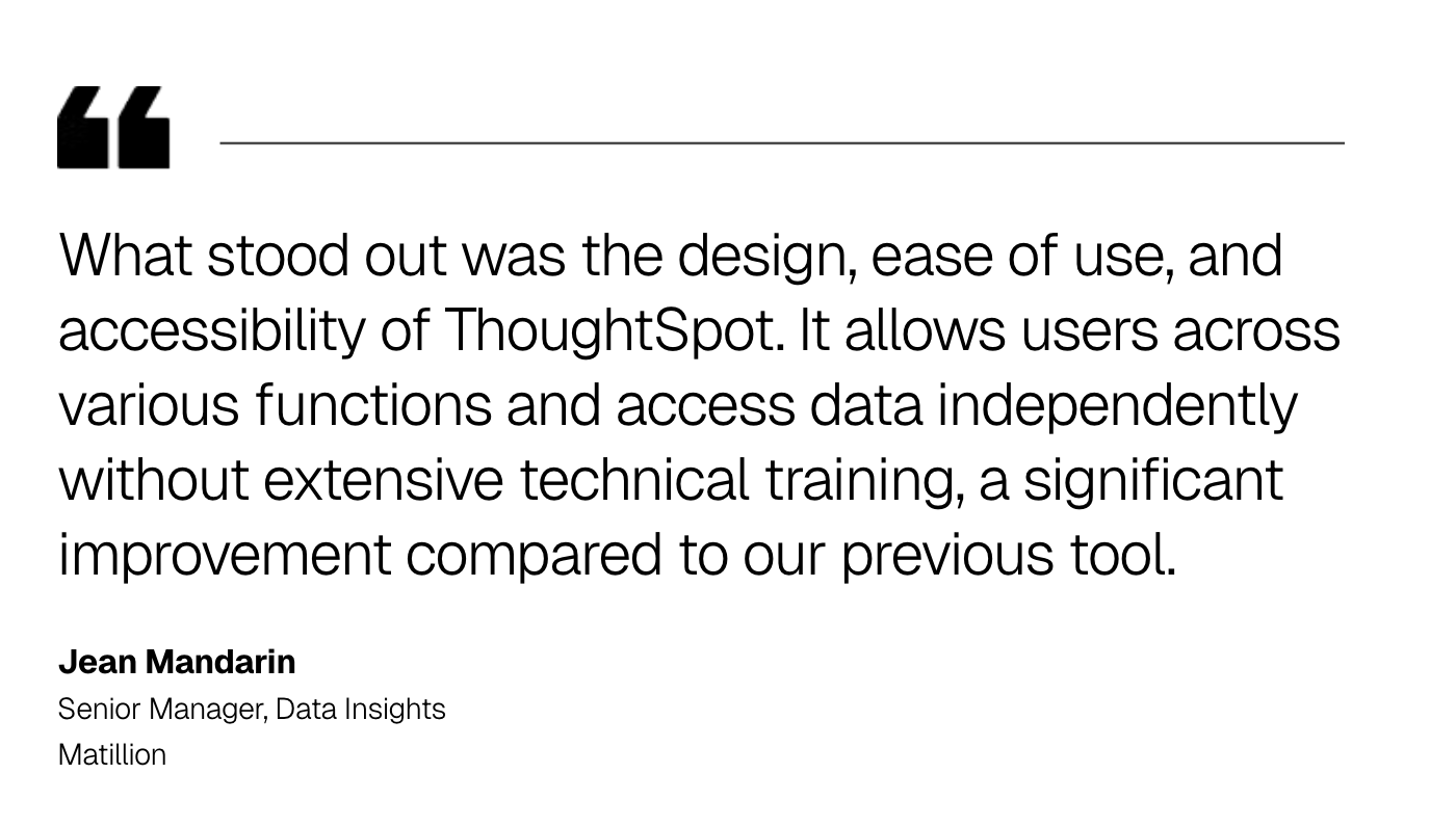
For example, Matillion achieved an 80% reduction in report requests after implementing ThoughtSpot, creating £75,000+ in annual cost savings while redirecting analyst time to strategic initiatives.
Effective dashboard design goes beyond arranging charts on a screen. It’s about creating interfaces that help people make decisions faster, with less confusion and more confidence.
With ThoughtSpot, you can move past static dashboards to a modern analytics experience where insights come to you, instantly, intuitively, and in context. When data becomes this accessible, decision-making stops being reactive and starts driving real impact.
Ready to see how modern dashboard design works in action? Schedule a ThoughtSpot demo and put your data to work.
Frequently asked questions about dashboard design
1. What makes a dashboard design effective?
Effective dashboard design combines clear visual hierarchy, purposeful chart selection, and user-centered layout principles. The key is to align design choices with your audience’s needs and business goals, so every element supports faster understanding and confident decision-making.
2. How many KPIs should be on a dashboard?
Best practice recommends 5-7 primary KPIs per dashboard view to avoid information overload. Additional metrics can be accessible through drill-down or secondary views.
3. How do you choose the right chart type for dashboard data?
Chart selection depends on your data story and user intent. Use bar charts for comparisons, line charts for trends over time, pie charts for composition, and scatter plots for relationships.
4. What are common dashboard design mistakes to avoid?
Common mistakes include cramming too many metrics into one view, using inconsistent color schemes, poor mobile responsiveness, and lacking a clear visual hierarchy. Other issues include missing context for metrics, slow loading times, and designs that don't match user workflows. Focus on simplicity, consistency, and user needs to avoid these pitfalls.
5. What role does color play in dashboard design?
Color influences perception and decision-making in dashboard interfaces. Consistent color palettes help users quickly identify patterns, while red-yellow-green coding systems provide immediate status understanding.


