


You’re surrounded by metrics, dashboards, and tools, but still missing the one thing you actually need: a clear path from the numbers to the right decisions. When every team pulls data from a different place, and even simple questions produce different answers, knowing what to trust becomes its own job.
SaaS metrics help cut through that noise. They highlight the shifts that matter, the patterns you should pay attention to, and the moments where you still have time to act.
We've narrowed it down to the 12 metrics that consistently shape growth for SaaS companies. These are the ones worth tracking in your real-time BI dashboard for SaaS analytics, the ones that actually influence how fast you grow and how confidently you operate.
What are SaaS Metrics?
SaaS metrics are the key performance indicators that help you measure and understand your software-as-a-service business performance. These quantifiable measurements give you visibility into critical aspects of your operations from customer acquisition and retention to revenue growth and profitability.
This gives you the clarity to spot trends, see how pricing changes actually perform, and understand what's working (or not) in your go-to-market strategy. When you track the right SaaS metrics consistently, you can identify opportunities, address challenges early, and make data-backed decisions that move your business forward.
Why are SaaS metrics important?
SaaS metrics matter because they give you the insights you need to understand your business health and make informed decisions. Without tracking the right metrics, you're essentially flying blind, making decisions based on gut feeling rather than data.
Here's what tracking SaaS metrics helps you do:
Measure growth accurately: You can see exactly how fast you're growing and whether you're on track to hit your targets
Understand customer behavior: You'll know how customers interact with your product, where they find value, and why they might leave
Optimize your spending: You can identify which acquisition channels deliver the best ROI and where you're wasting budget
Improve retention: You'll spot warning signs early and take action before customers churn
Make smarter pricing decisions: You can test and refine your pricing strategy based on real data about what customers will pay
Attract investors: When you're ready to raise capital, solid metrics demonstrate your business's viability and growth potential
In short: SaaS metrics replace assumptions with clarity. They show you which parts of your business are working, which aren’t, and where to focus next.
Start Getting Better Insights
12 key SaaS metrics and KPIs to track
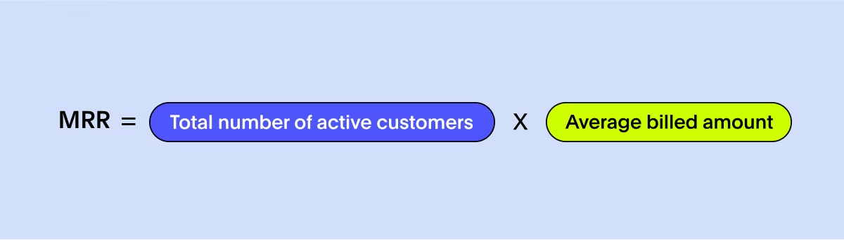
MRR is the predictable revenue your SaaS business brings in every month from active subscriptions. It strips away one-off transactions and gives you a clean signal of your true growth momentum. For most teams, it’s the number that shows whether the business is healthy or heading into trouble.
How to calculate it
Add up the monthly subscription revenue from all active customers. If you have annual contracts, convert them into a monthly equivalent so your numbers stay comparable. Once you do this consistently, you get a reliable baseline you can trust for planning and forecasting.
What does it tell you?
MRR reveals the story behind your revenue: Are you growing because of new customers, stronger expansion, or simply low churn? A dip often points to onboarding issues or rising cancellations. A plateau usually signals weak product activation or unclear upgrade paths.
How to improve it
The biggest levers are stronger onboarding, clearer pricing and packaging, thoughtful upsells, and reducing churn. In some cases, product redesign can help align features more closely with customer needs, leading to improved retention and stronger recurring revenue. When MRR stabilizes and grows predictably, every other part of your business becomes easier to manage.
CAC tells you how much it costs to acquire a single new customer. It’s one of the fastest ways to understand whether your go-to-market engine is efficient or burning cash. When CAC climbs without a matching increase in conversion or retention, it’s a clear sign that something in your funnel isn’t working.
How to calculate it
Add up all sales and marketing expenses for a given period, like ad spend, software, salaries, commissions, contractors, and then divide by the number of new customers acquired in that same period. The key is keeping your inputs consistent so CAC trends actually mean something over time.

What does it tell you?
A high CAC doesn’t automatically mean your strategy is broken, but it does mean your payback period is stretching. A sudden spike can signal weak lead quality, inefficient campaigns, or friction in your sales process. If CAC rises while conversion rates fall, your funnel likely needs attention.
How to improve it
To reduce CAC, focus on improving the targeting and efficiency of your marketing campaigns, refining your conversion funnels, and nurturing leads effectively. Implementing customer referral programs, using content marketing, and improving your sales processes can help lower your CAC and improve overall profitability.
Churn rate measures how many customers cancel or stop using your product during a period. It’s one of the most honest indicators of product-market fit if customers aren’t sticking around, acquisition won’t save you.
How to calculate it
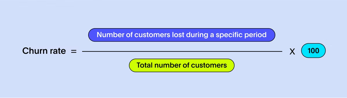
Divide the number of customers lost in a period by the number you started with. Look at both logo churn (customers lost) and revenue churn (MRR lost) to see whether you’re losing a lot of small accounts or bleeding high-value ones.
To calculate this SaaS metric, divide the number of customers lost during a specific period by the total number of customers at the beginning of that period. Measuring churn rate helps you identify potential issues, improve your product or service, and implement effective customer retention strategies. It allows you to focus on reducing churn, increasing customer loyalty, and maximizing customer lifetime value.
What does it tell you?
Churn reveals where the real problems hide: weak onboarding, low activation, unclear value, or poor support. A rising churn rate almost always shows up before other metrics start slipping. High churn also drives CAC higher because you’re constantly replacing customers instead of compounding growth.
How to improve it
Start with onboarding. Most churn happens in the first 30 days. Improve product education, tighten support response times, and look for patterns in cancellation reasons. Long-term, strong activation, habit-building features, and ongoing customer success programs make churn predictable and manageable.
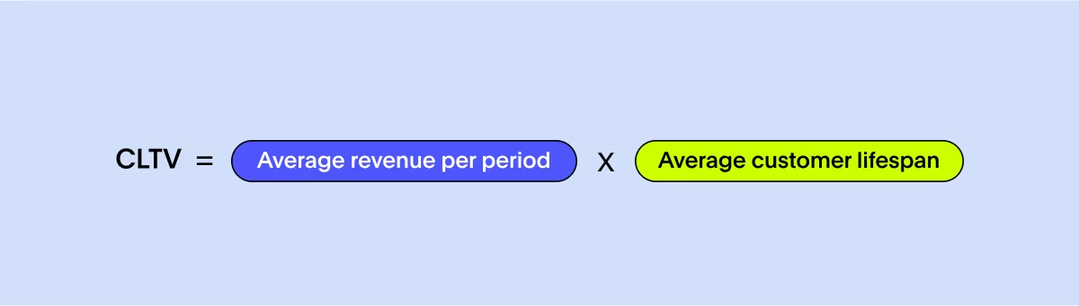
CLTV tells you how much revenue a customer generates over their entire relationship with your product. It’s the counterweight to CAC. The higher your CLTV, the more you can afford to invest in growth.
How to calculate it
Multiply average revenue per customer by their average lifespan. Sophisticated teams include expansion revenue, renewal likelihood, and cohort behavior to get an even sharper picture.
What does it tell you?
A healthy CLTV means customers see lasting value and keep renewing or expanding. A flat or declining CLTV usually shows retention issues, weak pricing, or limited upsell opportunities. If CLTV is too close to CAC, scaling becomes almost impossible.
How to improve it
Invest in better onboarding, expand your product surface area, and create clear upgrade paths. Deepen value through personalization, proactive support, and customer success programs. When customers grow with your product, CLTV naturally lifts.
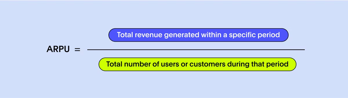
ARPU measures how much revenue each customer brings in on average. It highlights monetization health and helps you see whether your pricing aligns with the value customers get.
How to calculate it
Divide the total revenue in a period by the number of active users or customers. To keep trends accurate, track ARPU separately for different segments or plans.
What does it tell you?
Rising ARPU usually signals effective pricing or strong expansion movements. Declining ARPU may indicate discount-heavy sales cycles, over-reliance on low-tier plans, or customers downgrading because they’re not seeing ongoing value.
How to improve it
Create premium tiers, add usage-based components, bundle features more thoughtfully, and design clear upgrade moments. Analyze which features correlate with higher spend and surface them earlier in the customer journey.
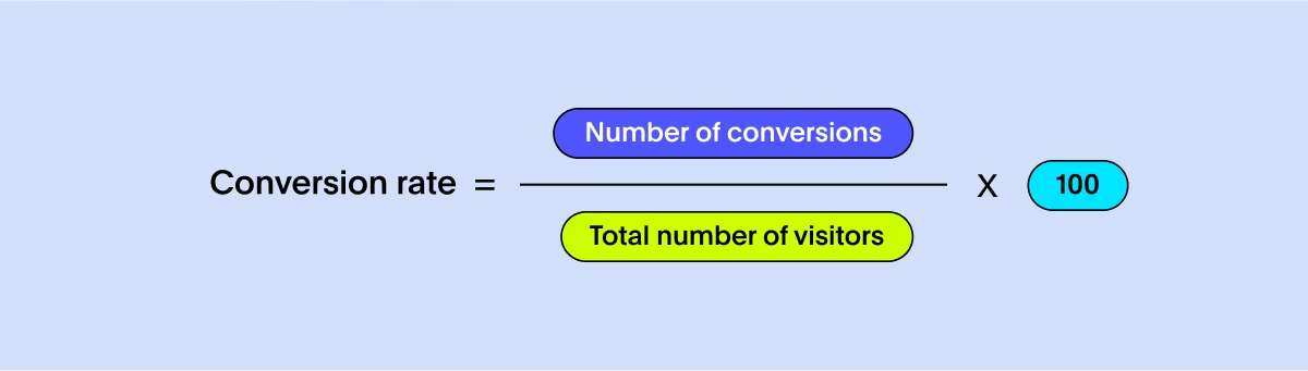
Conversion rate measures the percentage of website or landing page visitors who take a desired action, such as signing up for a free trial, subscribing to a newsletter, or making a purchase. It indicates the effectiveness of your marketing and sales funnels in converting leads into customers and helps you make data-driven decisions to achieve your business goals.
How to calculate it
Divide total conversions by total visitors, then multiply by 100. Track conversion at each funnel stage so you know exactly where leads drop off.
What does it tell you?
A strong conversion rate means your messaging, product positioning, and onboarding align well with customer expectations. A poor rate often highlights friction: unclear value propositions, slow pages, confusing flows, or a mismatch between ad messaging and product experience.
How to improve it
Tighten your homepage narrative, simplify signup, run targeted A/B tests, and improve your first-touch onboarding screens. Use qualitative feedback like heatmaps, session replays, and interviews to understand why users hesitate.
Gross margin reflects the profitability of your SaaS business after accounting for the direct costs associated with delivering your product or service. Monitoring this SaaS KPI is crucial because it helps you assess your business's financial health and profitability.
How to calculate it
Subtract the cost of goods sold (COGS) from total revenue, divide by revenue, then multiply by 100.

What does it tell you?
Healthy SaaS businesses often see margins above 75-80%. A declining gross margin means rising infrastructure costs, inefficient architecture, or overly expensive service delivery. Low margins make it hard to reinvest in growth.
How to improve it
Optimize cloud spend, refine your supply chain, negotiate vendor contracts, streamline support processes, and reduce expensive manual workflows. Product redesigns that lower compute or storage usage can also meaningfully lift margins.
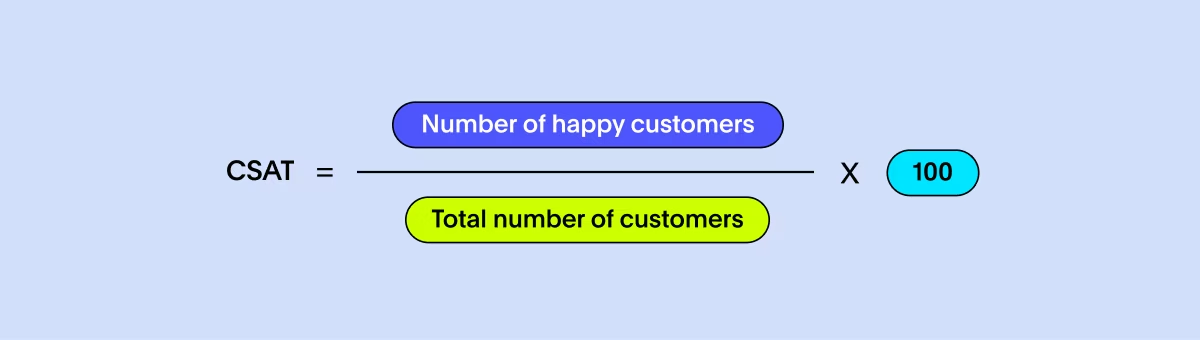
CSAT measures how satisfied customers are after an interaction or experience. It’s a fast, simple pulse on whether your product meets expectations. Monitoring CSAT is crucial because it helps you gauge customer loyalty, identify areas for improvement, and foster long-term customer relationships.
How to calculate it
Ask customers to rate their satisfaction on a short scale (1-5 or 1-10), then average the responses.
What does it tell you?
High CSAT shows customers are happy with specific moments like onboarding, support interactions, and product usage. Low CSAT is an early warning sign for churn, frustration, or unmet expectations.
How to improve it
Improve response times, streamline onboarding, fix recurring usability issues, and close the loop on every piece of feedback. CSAT rises quickly when customers feel heard and supported.
User engagement reflects how actively people interact with your SaaS product, how often they show up, what they do, and how deeply they explore your features. For most SaaS companies, engagement is the clearest signal of whether customers actually find ongoing value, not just whether they signed a contract. A strong user engagement strategy relies on understanding these patterns through customer analytics so you can see what keeps users coming back.
How to calculate it
Track metrics like daily or monthly active users, time spent in the product, number of sessions per user, feature usage, and key activation events. The exact engagement formula depends on your product’s core value moments, the actions that indicate a user is getting real value.
What does it tell you?
High engagement usually predicts strong retention, expansion, and advocacy. Low engagement is a red flag that customers aren’t forming habits, onboarding isn’t clicking, or parts of the product aren’t intuitive. If engagement drops across an entire cohort, you may have shipped a change that confused users or failed to deliver expected value.
How to improve it
Help users reach their “aha moment” faster through guided onboarding, in-product education, and contextual prompts. Highlight features that correlate with long-term success. Run user interviews and analyze drop-off paths to understand friction points. Engagement grows when customers know exactly what to do and why it matters.
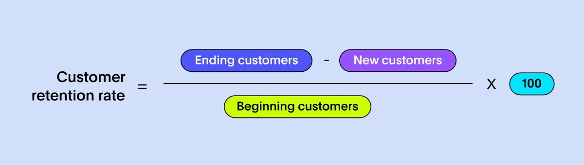
Customer retention rate measures the percentage of customers who stick with you over a given period. Strong retention is the foundation of any healthy SaaS business because every other revenue metric, MRR, CLTV, and expansion, depends on customers staying long enough to benefit from your product.
How to calculate it
Take the number of customers at the end of a period, subtract the number of newly acquired customers, divide by the number at the start of the period, then multiply by 100. Track retention monthly and by cohort so you can see when customers are most likely to drop off.
What does it tell you?
Retention exposes whether your product continues to deliver value after onboarding. If customers leave after two or three months, you likely have activation issues. If churn spikes at renewal, revisit pricing, packaging, or long-term support. High retention correlates strongly with high CLTV and efficient growth.
How to improve it
Give customers ongoing reasons to stay, such as structured onboarding, lifecycle messaging, feature adoption nudges, and proactive customer success for at-risk accounts. Clarify your value throughout the customer journey, not just at signup. Retention improves when teams close the gap between “we bought this” and “we rely on this.”
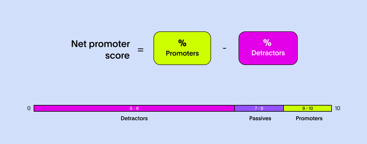
NPS measures how likely customers are to recommend your product, giving you a direct read on loyalty and brand sentiment. While it’s just one question, it captures something deeper about whether customers feel confident enough in your product to put their reputation behind it.
How to calculate it
Ask customers: “How likely are you to recommend us to a friend or colleague?” Score responses 0-10.
Customers scoring 9-10 are Promoters
7-8 are Passives, and
0-6 are Detractors
Subtract the percentage of Detractors from Promoters to get your NPS.
What does it tell you?
A strong NPS often predicts organic growth and positive word of mouth. A weak score usually highlights dissatisfaction in onboarding, support, or product usability. NPS trends often shift before retention does, making it a valuable early warning system for potential churn.
How to improve it
Close the feedback loop immediately. Thank Promoters, follow up with Passives, and dig deeper with Detractors. Address recurring themes in feedback, whether that’s confusing workflows, reliability issues, or slow support. Improving NPS is less about chasing a number and more about removing the friction customers repeatedly point out.
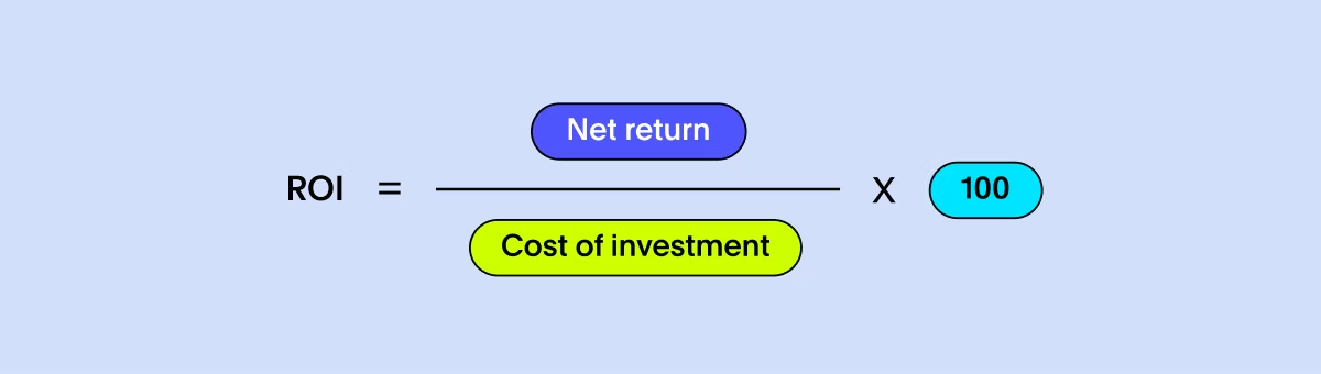
Return on Investment (ROI) shows whether the investments you make in marketing, product, infrastructure, or operations actually pay off. It’s the grounding metric that helps leadership decide where to scale, where to pause, and where to cut.
How to calculate it
Subtract the cost of an investment from the revenue it generated, divide that number by the original cost, then multiply by 100 to get your ROI percentage.
You can use this same calculation for campaigns, feature launches, tooling, or any initiative where you want to compare what you spent with what you earned.
What does it tell you?
ROI reveals which initiatives truly drive impact. A low or negative ROI may signal misaligned spending, poor targeting, long payback periods, or a product that hasn’t yet found its optimal market fit. High ROI indicates strong execution and efficient use of resources.
How to improve it
Run smaller experiments before scaling big bets. Double down on channels or features with proven returns and reduce spend on low-impact initiatives. Use consistent measurement windows so you can compare apples to apples. As your data foundation matures, ROI becomes less about intuition and more about evidence-based decision-making.
The future of SaaS dashboards
Dashboards and spreadsheet-driven analysis can’t keep pace with how fast SaaS businesses move today. When you’re trying to diagnose what changed right now, static reports won’t cut it. You need real-time, interactive views of your data, and a Liveboard gives you exactly that.
Picture a go-to-market manager getting an alert that CAC is suddenly trending in the wrong direction. Within seconds, they can drill into the data, spot which campaign is dragging performance down, and see AI-generated context that connects the drop to a shift in marketing spend.
That isn’t a stretch or a “future of work” fantasy. It’s what modern analytics workflows already look like when your BI platform is built for speed and clarity.
That’s why companies like PetSmart, Snowflake, and OrderPay use ThoughtSpot to power their SaaS dashboards. Instead of relying on stale snapshots, their teams explore live data, discover what’s driving change, and act before small problems become expensive ones.
Make data-driven decisions with ease
Tracking these SaaS metrics will help your SaaS company analyze and improve for success. If you're looking for an AI-powered analytics solution that can help you understand, analyze, and monitor all the essential SaaS business intelligence in one single platform, then ThoughtSpot is the perfect choice for you.
Sign up for a ThoughtSpot free trial today to improve the insights that matter most and make data-driven decisions with ease.
Frequently asked questions for SaaS metrics
1. Why do SaaS teams need more than spreadsheet analysis to track metrics?
Spreadsheet analysis works when you're early-stage, but it breaks down fast once you’re pulling data from billing systems, CRMs, support tools, and product analytics. Manual updates introduce errors, and you can’t drill into trends or explain sudden shifts. Modern business analytics tools give you real-time visibility and interactive data visualizations that let you explore the “why,” not just the “what.”
2. How often should I review my SaaS metrics?
Check fast-moving metrics like CAC, engagement, and conversion weekly. Review revenue and retention monthly, and performance metrics like ROI quarterly. Teams relying only on spreadsheet analysis usually catch issues too late, which is why more mature companies shift to business intelligence solutions that surface changes immediately.
3. Do I need a modern data stack to track SaaS metrics effectively?
Strictly speaking, no, but it makes everything easier. A modern data stack gives you clean, centralized data plus the ability to layer on interactive data visualizations and AI-driven analysis. This cuts the time between asking a question and getting an answer that drives action.
4. How do real-time SaaS dashboards help?
Static dashboards can’t show what changed in the last hour or why. Real-time dashboards and AI insights let teams drill into issues immediately, like a CAC spike or a sudden engagement drop, and act before it impacts revenue. This is why modern SaaS teams increasingly rely on Liveboards instead of stitched-together spreadsheets.


