This article was adapted from Bob Baxley's talks at Beyond 2023. Learn more and watch all of the sessions on demand.
At ThoughtSpot, we take product design seriously. Here's why:
It’s good for our company. Studies show that businesses that embrace design principles generate an average of 32% higher revenue growth. Plus, an IBM report found that teams with stronger SaaS designs and user understanding reduce development and testing time by 33%.
But more importantly, it’s good for our users. Clean designs save our users time, help them find better insights, and lead to higher ROI calculations for your business.

SaaS product design is largely the process of identifying a user's needs. Once you've done that, you can move on to planning, building, and iterating on your product—according to a set of established product principles—to address that need.
ThoughtSpot’s mission has always been to get the power of data into the hands of millions of users. We don’t expect our users to sit through hours-long training on how to use our product. We put in the extra effort to create a business intelligence (BI) experience that’s approachable, intuitive, and empowering.
And that’s the essence of great SaaS design—building tools and experiences that accommodate the user, instead of forcing the user to put in the work to use the tool. In this article, we’ll break down how to apply the principles of SaaS product design, using our own new homepage as an example.
Get a sneak peek of our new design here.
The three phases of product creation at ThoughtSpot
Effective product creation has three distinct phases:
Start with clear thinking
Formulate a plan
Build collaboratively
Keep reading for the play-by-play breakdown.
Stage 1: Start with clear thinking

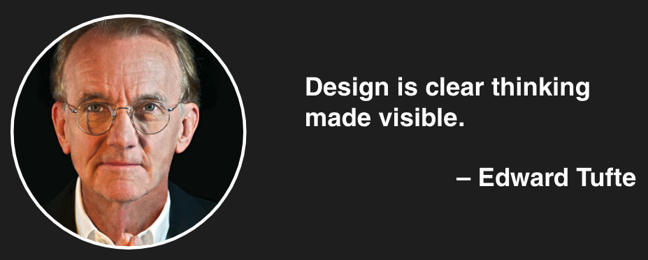
A statistician and professor expert, Edward Tufte paved the way for clarity, accuracy, and integrity in data visualization and information design. And at ThoughtSpot, we practice what Tufte preaches. So, before we build any new product or feature, we:
Review our vision: A world where everyone has quick and easy access to facts
Remind ourselves of our mission: Put the power of data into the hands of millions
Revisit our UX strategy: Encourage exploration and reward curiosity
We keep these high-level goals top of mind before even starting the product planning process.
Establish clear product design principles
Many design-centric companies (think Google, Dropbox, or Pinterest) publish their design principles. That’s great, but it doesn’t go far enough. After all, products aren’t just built by a team of designers—they’re built by marketers, product managers, growth teams, engineers, and customer success teams. All of these disparate groups need to start from the same basic premises to ensure cross-collaborative, strategic decision-making.
At ThoughtSpot, we’ve developed three product principles that help steer the “how” and the “what” of our design decisions:
Flexible: We design our data products and features to adapt easily to a wide variety of needs and use cases.
Extensible: We design our products to readily accommodate new features and ideas.
Intelligent: We aim to create products that anticipate your needs and serve up what you want to know without you even having to ask.
These three product principles help you start the collaborative design process on common ground and form the basis of a strong user engagement strategy—the key to creating value for your users.
Stage 2: Formulate a clear plan

Next, it’s time to start planning what you will build. Remember, SaaS design is never just “set it and forget it.” It’s an iterative process that transforms throughout the phases—overview, sketch, mock-up, prototype, version one, and all of the subsequent product launches to follow.
The key to success is building this iterative mentality into your SaaS design process. Here’s how we do it at ThoughtSpot:
Project Canvas
We like to kick things off with a project canvas. This is a simple, one-page document that defines the following:
Why the project is valuable
What we’re building—the project scope
Who specifically it’s for
The design strategy—the way we’re thinking about the project in the simplest terms
Key audience requirements for the project
Timeline, including dates for “go/no go,” soft launch, and full launch
The audience narrative—the story behind the project and how people will use it
Define system elements
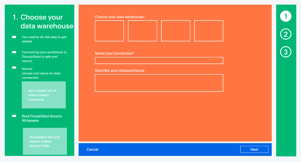
Next, we outline the elements—all of the user interface, features, and content—included in the project. Here’s an example:

Create a mock-up of the core concepts
At this point, we’ll start to create quick designs to show the different elements involved in the product. This lets us visualize the end result before diving into the heavy engineering work.

The mock-up stage is your opportunity to question what you’re seeing against your vision, mission, strategy, and product principles. You might also use this opportunity to question individual features, asking yourself, “Does this product or feature make sense?”
Concept testing
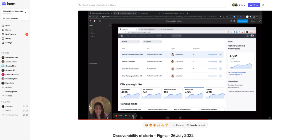
Once the mock-up designs are in place, we use design software to build the layouts of the actual product—including the user flow through each phase of an experience.
This is the point where you take the time to consider all the possible outcomes from a new experience—what experience happens if a user clicks this button, what content will they see, and how will they get back to the main page?
By building out all of the potential user pathways, you put your concept to the test, ensuring the best possible experience for your end user.

This is the ideal time to introduce peer and user reviews. In our case, we brought in internal users who spend time in our product to give feedback on the new homepage design.

Stage 3: Build with competence and collaboration
Once we’re ready to start building, it’s time to assemble the right team. Most of the products we work on require at least four roles:
Product designer
Software developer
Quality assurance engineer (QA)
Project manager
In many companies, you’ll also need a data analyst or analytics engineer to provide you with the data you need to make product decisions. Luckily for us, we can often use our own Liveboards to quickly find the information we need.
Building the right team starts at the hiring phase. As a company, we look for a number of core competencies, including curiosity and product empathy. Perhaps the most important competency is a collaborative mindset—an openness to new ideas, cooperation, and communication.
Collaborative designers understand that they need to:
Work closely with the team and other stakeholders to develop the product
Communicate with sales and marketing to bring the product to market
Listen to their community—to take feedback and insight and translate it into an actionable product that serves their users
You can’t build a product in a vacuum. Exceptional SaaS design isn’t produced by a skilled designer, but rather by a collaborative team that works well together and knows how to listen to users.
Our SaaS product design: The new ThoughtSpot homepage
We designed our new ThoughtSpot homepage by going through these precise stages. Our aim was to create an entirely new user experience that captures the power of our AI-powered search.
This experience was built for viewing pleasure and engagement. In fact, it was designed to resemble a video streaming service for business data. The whole idea was to seamlessly serve information you need and encourage discovery of new data and insights you didn’t even know to look for.
Here’s what’s included:
AI-powered search
This is far and away the most powerful interface we’ve ever created. The design makes it incredibly quick and easy to ask ThoughtSpot Sage a question or browse AI-generated suggestions if you’re unsure where to start. You can also click on popular properties, authors, or tags to instantly browse your library using our new parametric search capabilities.
Watchlist module
The watchlist gives you an instant view of your most important metrics. We’ve used what we learned from our recent mobile app redesign to create an instant view of your most important metrics.
Trending module
Keep track of trending data with an AI-managed list of Answers and Liveboards that adapts to whatever is happening at the moment with your business.
Favorites module
With the favorites launchpad, you can find all the information that’s most important to you with a single click.
List view
The list view module displays the most recent items you’ve viewed and allows you to instantly sort your library to make it easy to locate and open existing Liveboards and Answers.
Learning module
This is a rotating gallery of video content, segmented for novice and sophisticated data users. Our goal is to empower people to become more data-literate and advance their data storytelling skills.
In the coming months, we’ll continue adding more modules and customization features so you can add, remove, and reorder modules to make the space your own.
Experience our approach to SaaS design for yourself
Our mission influences everything we do, including how we design our products, tools, and features. We believe our new homepage reflects that. It was designed to be flexible, extensible, and intelligent enough to serve up the facts you need, when you need them—whether you’re a data superstar or a data novice.
The new homepage will be available later this year. In the meantime, we invite you to get hands on with our product and experience how easy it is to embed analytics into your user experience. Or if you’re interested in test-driving our new AI-Powered Analytics experience, start your 30-day free trial today.


