When you’re ready to visualize your data, it’s important you pick the right type of visualization. Some types of charts might only work for certain types of data, and some convey different messages about your data.
Two of the most common charts used for data visualization are bar graphs and histograms. These two can look alike, but they aren’t two names for the same thing. Bar charts and histograms are different, and they communicate different information about your data. Here’s a quick run-down of what these two chart types are, the differences between them, and when you should use them to visualize your data.
What is a bar graph?
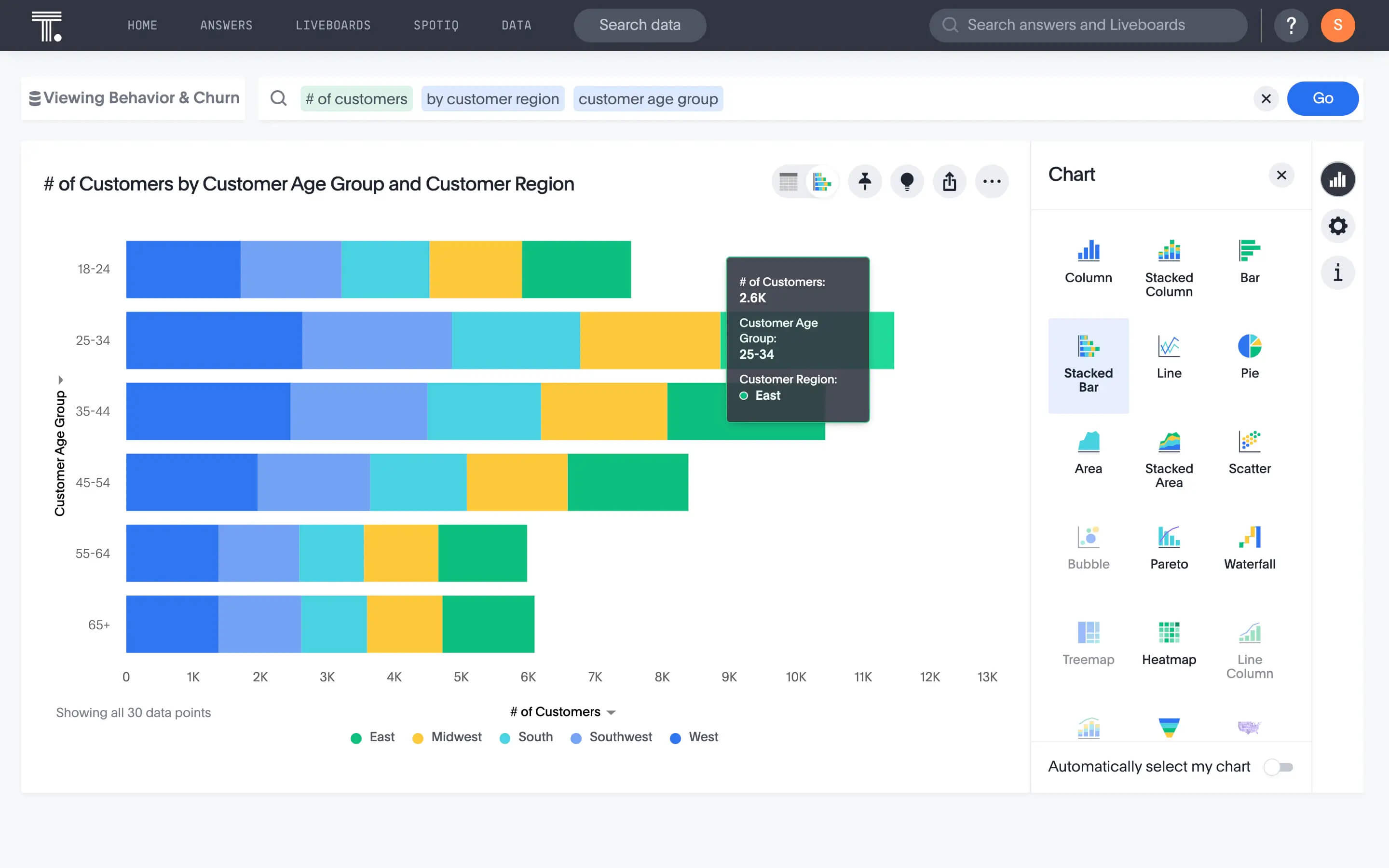
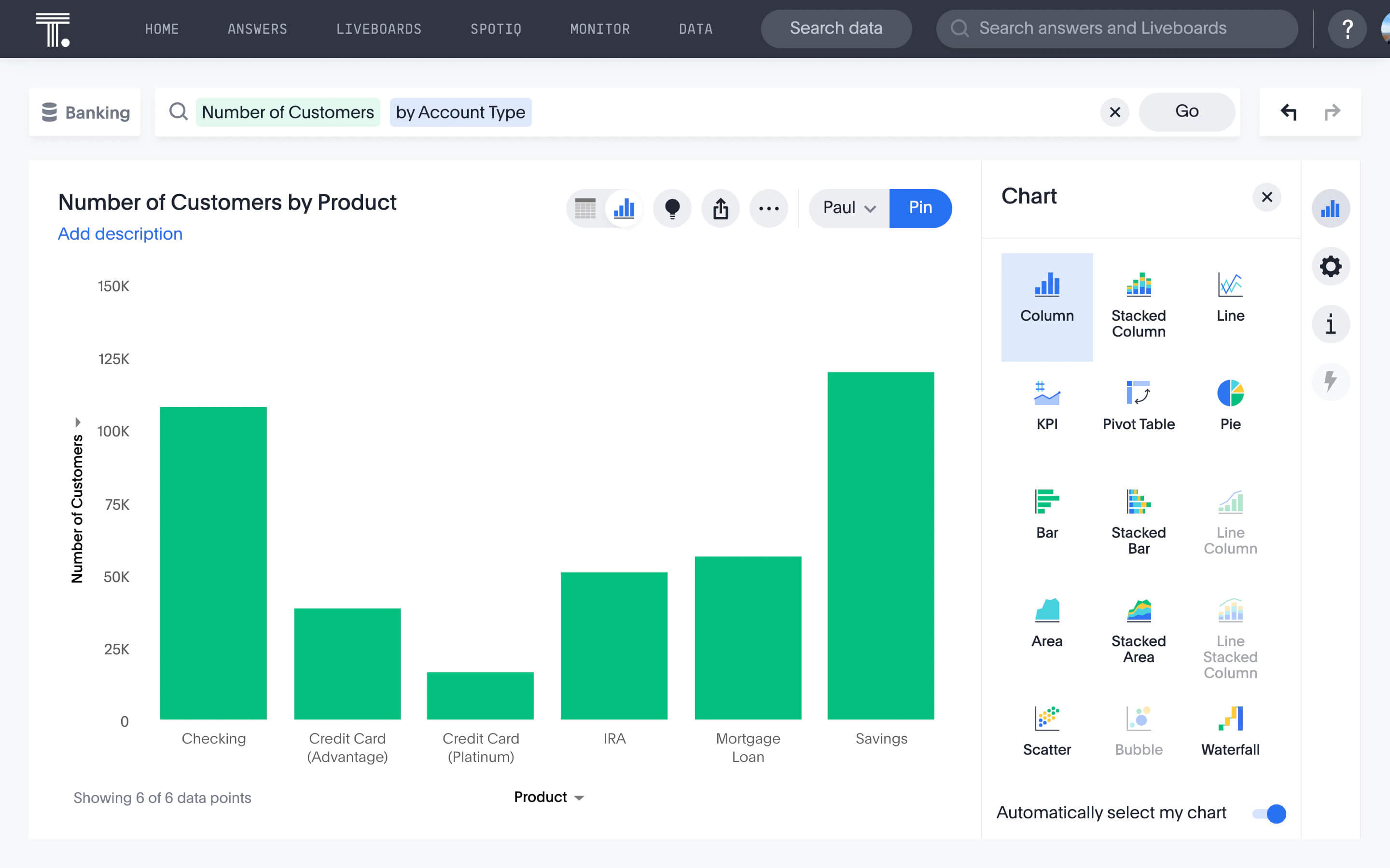
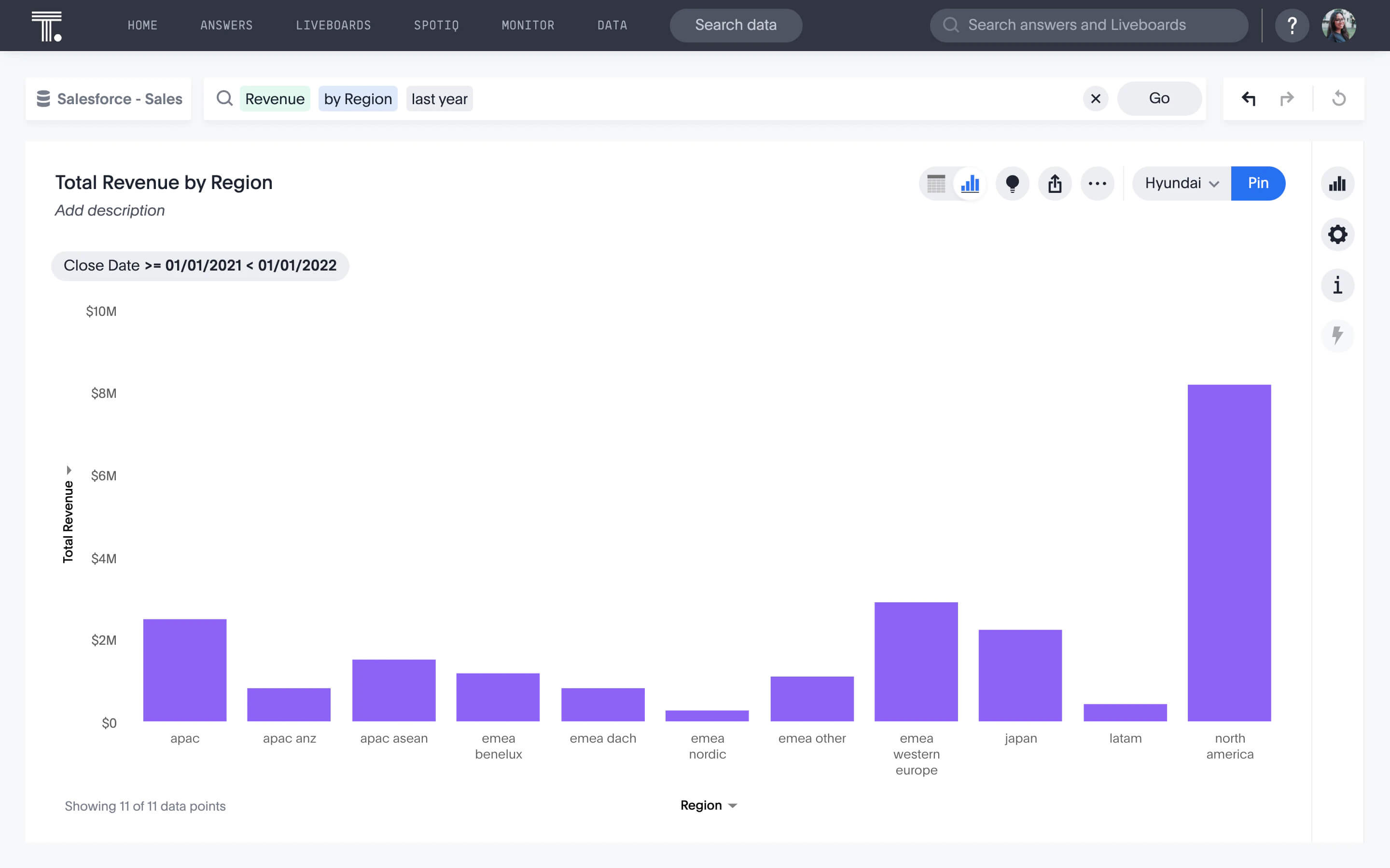
A bar graph, sometimes called a bar chart or column chart, compares quantitative (that is, numerical) data between different categories. Bar graphs list these different categories along one axis, and their respective amounts along the other. You can plot averages, sums, or any numbers you want in a bar chart, as long as there’s just one value per category (that is, per bar).

You’ll know when you’re looking at a bar graph and not a histogram because there will be a slight gap between each of the bars, and the axis that’s perpendicular to the bars will have discrete categories along it.
What is a histogram?
A histogram is a simple way to visualize a single, continuous, dataset. It shows the distribution of the data; in other words, the relative frequency of numbers of different sizes.

To make a histogram, you’ll divide your dataset into what are called bins, or groups of numbers of a similar size. For instance, if your data contains values that go from 1 to 100, you might make a histogram with 10 bins: 1 to 10, 11 to 20, and so on until 91 to 100. Then each bar would be taller or shorter depending on how many numbers from the dataset fall in each bin.
What is the difference between bar graph and histogram?
Histograms and bar graphs look similar, but there are a lot of differences between them. When you’re deciding which type of chart to use, it’s important to know what type of data you have and what kinds of questions you hope to answer with it. Here are some of the key differences between bar charts and histograms:
A bar graph compares quantitative data between different categories while a histogram visualizes a single, continuous, dataset.
bar graph allows you to compare and contrast metrics (averages, sums, etc.) across different categories while Histogram allows you to view the distribution, or relative frequencies, of values in a dataset.
A bar graph is a plot of a single data point (a sum, average, or other value) for each category while a histogram is a plot of a range of data.
Each bar in a bar graph represents the datapoint for its designated category while each bar in a histogram represents the quantity of data points that fall within that bin, or a smaller range within the larger dataset.
In a bar graph, you can rearrange the bars in whatever way makes the most sense. This might be largest to smallest, smallest to largest, chronological or geographical order, or something else while in a histogram, you can’t rearrange the bar elements. The bins must be presented in numerical order from lowest to highest.
When to use a bar graph vs histogram
Once you’ve got the hang of the differences between bar graphs and histograms, it’s simple to pick which one to use to visualize your data. It all comes down to whether you want to compare between categories or look at the frequency of certain values in a single dataset.

For instance, you could use a bar graph to plot how many people live in each of 10 major cities, how many votes different candidates received in an election, or how many pieces of candy each family member ate last Halloween. Business-related bar graphs might be total revenue for each division in the last year, new clients added by each partner, or average number of online sales for each of your top 10 products.
On the other hand, you can think of a histogram as a more informative way to summarize a dataset beyond just calculating the average, minimum, and maximum. For instance, you could plot the ages of your customers to reveal the relative proportions of people in different age groups. So even if you already knew the average user of your product was 40 years old, you might learn from a histogram that you have surprisingly strong product adoption from seniors, or are missing 30-to-35-year-olds entirely.
Sometimes, you might even want to plot the same data in a histogram and a bar chart to learn different things. For example, you might have daily sales numbers for your company for a year. Plotting these 365 data points in a histogram will show you how often you were hitting lower, higher, and mid-range numbers. It would also reveal how consistent your numbers were, as well as how many extra-high or extra-low sales days you had.
But you might also want to look at the same data month-to-month. To do that, you’d calculate the average daily sales for January, February, and so on, and plot the 12 means in a bar chart, and order the bars chronologically. Now you can see that sales fell off during the summer months, and surged again during the holidays.
Take your data visualizations further
Bar charts and histograms are easy to make. You can sketch them out with a pencil and graph paper if you really want to. But it’s the 21st century, so we recommend not only digitizing but also using the right data visualization tools that will take your data visualizations beyond the next level.
Platforms like ThoughtSpot automatically generate best-fit visualizations for your search queries using AI-Powered Analytics so you can quickly go from insight to action.
Ready to learn more? Contact us today to set up your free 14-day trial.


